Showing posts with label EOC. Show all posts

Thursday, September 16, 2010

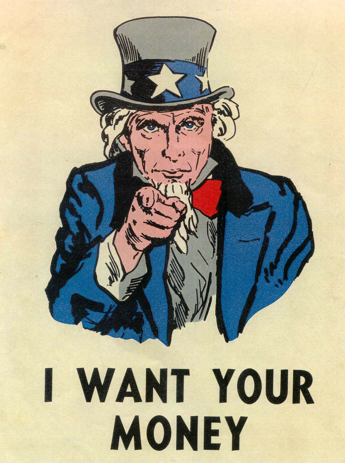
EOC: Week 10: Art Serving Capitalism

This statement is quite bold. Capitalism has such a negative connotation to it nowadays, especially in the current economic climate.
But is that really what advertising is? Art serving capitalism?

In a sense, yes. Advertisements seek to sell product. These products seek to be bought by customers. These customers are part of a capitalistic society, making money off its citizens in any way it can.
A quote from Goodby Silverstein and Partners sums this thought up pretty well: Art teaches business to dance. It's all about showing us what you're made of and why we should buy your product. Don't just tell us why, but SHOW us. That's what art is all about: showing something and getting a reaction or response.
But where does this relationship between art and advertising come from? It is possible that "like any significant aspect of the human experience, advertising has been interpreted through art... As art incorporates advertising and information and information media includes more ads and design, advertising cannot help but inch towards more honesty and art." (http://www.amedianysf.com/historyofadvertising.html) Is this to say that with every step towards art, advertising is becoming more honest? One could only hope.
But it's safe to say that our capitalistic ways will not be lost on future generations any time soon. We will still want to buy things, and once we buy those things we'll want more. We simply aren't ever satisfied. And why would we? There are all these clever ads influencing you...and your wallet.

Thursday, September 2, 2010

EOC: Week 8: Really Good Example of Chapter 8


AT&T likes to be very innovative when it comes to their advertisements, print and otherwise. This one, which features hands painted and shaped like the Eiffel Tower in Paris, France, is nothing short of innovative.

One of the great thing about it is that it doesn't look like an ad. Rather, it follows the advice of Kevin Roberts, CEO of Saatchi & Saatchi, as it has "simplicity, relevance and an immediate emotional connection to the consumer's heart, through a stunning visual" (Advertising by Design, Robin Landa, pg. 143).

The stunning visual in this case is the "hand-made" Eiffel Tower with the cell phone (and the company's logo) in the center. With this, the ad is pushing the idea that AT&T's phones and service are reliable and expansive... all the way to France.

The size of the logo is very important, as well as its context. This context "often determines its impact and provides information" (Advertising by Design, Robin Landa, pg. 148). With the logo where it is in the image, both on the image and on the product, the ad successfully demonstrates good graphic as well as advertising technique.

Week 8: EOC: Authority

Stefan Sagmeister of Sagmeister Inc. put it best when he said "Make it huge, or make it tiny."
I was already thinking about the design and layout of my ad, especially as far as how I'm going to incorporate typography into it. This statement confirmed for me the ad's design.

So far, I'm thinking about putting my product in the center of the page, big. (Not sure yet what I want the background to be... White? Black? A photograph? Hmm...

Also, Michael Sickinger of Firmenich said something very interesting: "Type, by itself, can be the design." So what if I put the product itself inside the font, as a letter unto itself? Ah!

There's really so much you can do with type, it's kind of overwhelming. But in this case, overwhelming might be a good thing.

Thursday, August 26, 2010

EOC: Exciting Ad


At first glance, this ad just looks like a still from a mess in motion. The soup is spilling, the parsley is flying, and the sleeve is about to become in desperate need of some cleaning.

But wait... that tag line captures my eye (it has a fun shape and design all to its own). "Because stains love your clothes."

Oh! That sleeve is a face! The soup is a face! And though the sleeve is not very excited about getting a smooch from soup, it really has no other choice. That soup is flying everywhere!

There's a great use of positive and negative space. Though the images are not directly in the center, they do attract your eye from the bowl of soup to the face of soup.

The components also work in unison. You can practically feel the bowl about to drop and the faces meeting.

Also, the vivid colors keep your attention. If this ad were in, say, black and white, I'm not sure I would be as likely to keep looking and thinking about the ad as I am with the orange, green, and the faded background.

Overall, this ad is really dynamic and gets the point across: BUY TIDE! KEEP YOUR CLOTHES CLEAN!

EOC: Final Project: First Thoughts

I've got a few thoughts rolling around in my head as far as what product to choose for my Advertising Final Project. I knew right from the beginning that I wanted to choose a Jewish/kosher product, because I know those products best.

Being "unorthodox", I figured out my slogan before I came up with a product. (You're going to have to wait just a little longer to find out what my slogan is.)

I have 3 products in mind so far:
Zomick's bakery (the BEST challah!)
Schnitzel (the Friday night staple)
Bagels (who doesn't love bagels, lox and schmear??)

So that's what I've got so far. Stay tuned to find out what my slogan is and how this develops!

EOC: Week 6: Make 'Em Laugh


We live in a world where everything we do, think, and know must be confirmed computers and the Internet. So what is one to do one is in a dangerous situation and needs a way out?

GOOGLE IT!

And what are you going to trust your survival and "googling" to? In this ad, the answer is the Philips V900. This phone can apparently get you out of a bind because it is reliable and fast. It's so fast, in fact, that it can give you a solution while a hungry bear is coming at you!

The caption reads, "Fast Internet access when and where you need it". Now, I don't know how often I'm going to need to Google how to escape a grizzly, but the ad does make you think that to be without this phone and its reliable Internet capabilities is setting yourself for trouble.

So get a Philips V900! You'll never be caught clueless in an unpleasant situation again.

Thursday, August 19, 2010

EOC: Week 6: Jerry Metellus

It was a very exciting afternoon at the Art Institute today... Jerry Metellus, renowned photographer (and 8-pack denier), came to speak to us! I don't know about everyone else, but I've been looking forward to hearing him speak for weeks! His photography is so inspiring and unique, and what he said really resonated with me.

I particularly like his motto: Do it seriously, don't take it seriously. A photographer should be loose yet sure of himself/herself. If you come into a photoshoot, or any life situation in general, and you're stern and stiff, chances are the outcome of whatever you're doing will appear stern and stiff. (Unless your client is a stick-up-the-butt, you really don't want that impression.)

He also spoke a lot about rights of usage and how vitally important those are to a photographer's career. Even if you're the one who took that photo that's on billboards across the country, you don't get a penny if you gave up your rights to it. and that could be the photo that changes the world! How sad would it be if you couldn't get the credit for it??

Finally, make sure your "tool box" is constantly being filled with new tools. This "tool box" is what you get once you graduate from college. It's just waiting to be filled with experiences and lessons that you learn in life. It's so important to get out there and actually LIVE. Every experience takes you to another experience that takes you to another, and so on and so forth.


Now comes the next step: work towards an internship with Jerry. I know I just started at AI, but I think I could learn so much from him and his team. I want to learn about the ins and outs of the world of photography, especially the kind he does. So, I'll speak to my advisers and hopefully get on the right track towards making this dream come true.

Thursday, August 12, 2010

EOC: Week 5: Ad Categories


Category 1: Endorsements Drew Barrymore, actress, director, and now spokeswoman of Covergirl Cosmetics, can afford to use the most high-end and expensive makeup products in the world. So why is her [beautiful] face the canvas for inexpensive mascara? She is endorsing the product, making consumers see that she uses it. "My, she's so beautiful! If I use this mascara, will I be beautiful just like her?" -- "Yes!" Covergirl would respond. With a hot celebrity endorsing a product, how could you lose? Exactly. YOU CAN'T.


Category 2: Declarations
Through an image of blood-stained shattered glass and a simple tagline: "Get the Message", the American Academy of Orthopedic Surgeons is evoking a very strong emotional and physical connection: texting = death. It's not new news that texting while driving is dangerous, but when an ad shows in the most "PG rated" way its consequences, it strikes a chord with, well, EVERYONE. It's as simple as a piece of shattered glass.


Category 3: Meta-Advertising
This Apple ad is pretty much the definition of meta-advertising. "I'm a PC. I'm too business oriented and my operating system is so-so." "I'm a Mac. You should buy Macs because they're awesome, just like me." Just like all of Apple's other ads, this one is very simple, sweet, and to-the-point. Just looking at the differences in the men's outfits, it's clear that Macs are more relaxed, whereas PCs are suit-and-tie and restrictive. I'm already an Apple girl all the way. But even if I wasn't, this ad would make me run out and buy a Mac, just being this clean and simple.

Thursday, August 5, 2010

EOC: Week 4: Bob Isherwood - Why is he Important?


Bob Isherwood was the Worldwide Creative Director for the advertising agency, Saatchi & Saatchi. In his career which spans 35 years, he has become one of the most influential and respected individuals in the industry.

Isherwood "believes passionately in the power of ideas to change the world... [His] vision and leadership have been instrumental in transforming Saatchi & Saatchi from an ad agency to a global ideas factory." http://www.saatchi.com/news/archive/clio_lifetime_achievement_award_for_bob_isherwood This rings so true when analyzing the firm's range of advertisements.

This first one, for example, speaks about domestic violence and how verbal violence can escalate into physical violence. This PSA says so much without using any words except for the tag below, which reads "Verbal abuse can be just as horrific."

The linked ad is very creative and an unexpected way to connect the consumer to the product, in this case Cheerios. It's saying, "Your heart is the source of beauty and greatness. Let Cheerios help it exude beauty." http://www.saatchi.com/en/our_work/ideas_gallery/cheerios_what_runs_through_your_veins

Isherwood said it best in an interview from the textbook Advertising by Design (Robin Landa, 88), "I need to understand what the problem is to be solved; otherwise how will I know when I've found the answer?" With this ethic, Bob Isherwood greatly impacted the way Saatch & Saatchi, and the advertising world as a whole, works.

Thursday, July 29, 2010

EOC: Week 3: Tobacco Advertisement


-Interpret the problem: Consumers may not have wanted to smoke cigarettes after hearing of the adverse side effects associated with smoking, among them unflattering stains on teeth. The tobacco industry, more specifically in this case, Viceroy brand cigarettes, identified this problem and came up with a revolutionary idea: filters!

-Understand the creative brief: The strategy the industry decided to use was to go straight to the authorities on teeth: dentists. Their thinking may have gone along the lines of “If we get the dentists to endorse our product, the public will think our cigarettes don’t stain their teeth!” Quite a strategy.

-Say it outright: This ad didn’t use any fancy language or confusing graphics. Instead, it gave a concise reasoning of why and how Viceroy Cigarettes “trap” nicotine and tars. An interesting tidbit about how this company “said it outright” is that they added a disclaimer at the bottom of the ad, in much smaller print. So even though “You’ll be glad you did” get Viceroys, note that “no filter can remove all nicotine and tars, nor does Viceroy make this claim”.

-Know your audience: The audience in this case is consumers who don’t particularly trust cigarettes because of potentially adverse side effects. Viceroy’s mission, however, is to make them think that smoking this brand of cigarettes can actually be good for you, since “no tobacco crumbs can get in your mouth” with this filter.

-Write your objective: Consumers will smoke Viceroy Cigarettes because they contain a filter that prevents the adverse side effects the public has complained about.

Thursday, July 22, 2010

EOC Week 2: Ethics in Commercials

Consumers are inherently gullible. We believe what we hear, regardless of how unfounded and ridiculous it may be. Case in point: the recent stream of ads promoting high fructose corn syrup. Anyone who has ever taken any sort of health class, let alone read the nutrition facts and ingredients on a food label, knows that high fructose corn syrup (HFCS) is VERY, VERY BAD. The ad agency that’s promoting HFCS might be calling it a “sweet surprise”, but it should be called “sweet death”, because that’s what it’s going to end up doing. For all intents and purposes, the Corn Refiners Association is doing the same thing the tobacco industry is doing: killing its best customers. “Regularly including these products in your diet has the potential to promote obesity – which, in turn, promotes conditions such as type 2 diabetes, high blood pressure and coronary artery disease”. http://www.mayoclinic.com/health/high-fructose-corn-syrup/AN01588 I hate to be the bearer of bad news, but moderation is just not going to cut it. Kids are the greatest consumers of HFCS since it is in practically everything they eat, from sodas and even some juices to the cereal they eat for breakfast.

“This American-made ingredient maintains freshness in condiments, enhances fruit flavors… retains moisture in baked goods. It has contributed to food choice and value for decades. In this economy, every little bit helps.”(http://www.corn.org/cbsnews-health-report-hfcs.html) I’m sorry, but even in this economy, giving millions of people the death sentence of diabetes or morbid obesity is NOT helpful.

This commercial is one of the most unethical I’ve seen in a while (and there have been some pretty questionable ones in the past few years). The most surprising part of the whole thing is the fact that it’s not even the children that are promoting the HFCS but the MOTHERS, the ones who are supposed to have the kids’ best interests in mind! (And the color of the drink? That artificial, slimy red? Gross!) Let’s let our children be high on life, not sugar.

Thursday, July 15, 2010

EOC Week 1: VW Lemon

“The ad featured a black and white photo of the Volkswagen Beetle with the word “Lemon” in bold san serif font… that proclaims that this particular car was rejected by Inspector Kurt Kroner because of a blemish on the chrome piece of the glove. The ad goes on to describe the rigorous inspection process…” (http://www.writingfordesigners.com/?p=1731)

But what makes this particular advertisement so significant? The design and delivery was vastly different from ads that came before it. “Ads before it were either information-based and lacking in persuasion, more fantasy than reality, or reliant on the medium's ability to deliver repeated exposure.” (http://www.bizjournals.com/sanjose/stories/1999/11/22/smallb7.html)

However, this ad was not only famous for its print value. Through television, Volkswagen “made the emotional connection between the car and consumers…” In a commercial set at a funeral, “the voice of the deceased bequeaths his fortune…To my nephew (who was mourning in a Volkswagen Beetle), who often said ‘A penny saved is a penny earned’ and ‘it surely pays to own a Volkswagen,’ I leave my entire fortune.”Because of this connection between merchandise and customer, Volkswagen was giving its audience a compelling reason to purchase their vehicles. (http://www.syl.com/bc/advertisingcampaignforvolkswagenbeetletheno1advertisingcampaignofthecentury.html)

Though there is truly a multitude of reasons why the VW Lemon advertisement was so influential, one of those chief among the others is this: it taught the population how to shop. When opening their wallets, customers wanted to know for a fact that the product they were buying was that of quality manufacturing. The Lemon ad helped shape that mindset. “The point is that to analyze the question of which benefits to communicate, we really need to know which attributes are considered in making the brand-choice decision and which of them are most important in the targeted product-market situation.” (http://books.google.com/books?id=trqPlpLpjyAC&pg=PA264&lpg=PA264&dq=volkswagen+lemon+ad+influence&source=bl&ots=9Jck-WHiYx&sig=tfJwoPXzluyfYusViYwpSfcuw6Y&hl=en&ei=VH4_TLAZwYHyBqLg6a4K&sa=X&oi=book_result&ct=result&resnum=1&ved=0CBUQ6AEwADgU#v=onepage&q&f=false)

The Volkswagen Lemon Ad is iconic and historic, changing the way people live, shop, and connect to products.